Website Consulting, Design, Implementation
My sites all look different because my clients are all different.
First thing, we pin down what the site is supposed to do, and who will be the audience.
Next, we plan out the site in detail. And plan how interactions will work. At this point we have a pretty good handle on what the project is, in terms of scope.
Then comes look and feel, colors, fonts, and all that fun stuff.
Then we go ahead and build it, sometimes working with a partner who does the back-end programming.
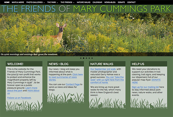
Mary Cummings Park
A site in Wordpress for a non-profit group that works to protect and enhance a rare piece of open space inside the Rt 95 beltway near Boston. The site uses a number of Wordpress plugins to create flexible multi-use blogs, galleries, and forms.
Ironclad Construction Photography
Photographer Lou Jones, Boston photo legend, is a fearless construction shooter. Lou has ascended to the tops of various construction sites in Boston in places that most of us could never handle.
He needed a website to showcase the extensive documentation he is doing of major contruction at Winthrop Center and Downtown Crossing.
The site also acts as a library where clients with password access can find and download full size image for further use in print and online.
Lou is also writing a series of short photo-bio-essays about construction workers. You can click to these from the home page.
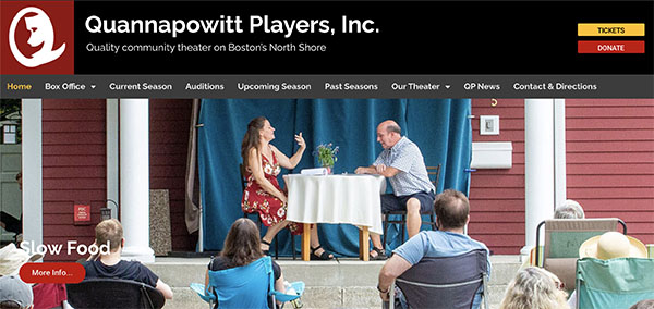
Quannapowitt Players
One of metro Boston's premiere community theater groups, QP has been puttinig on plays since the 1930s. We created a new Wordpress site using a number of customized features. The highlight of the site is the growing set of galleries of past plays. (I happen to have done the headshots and production photos for QP for the last 20 years...)
Health Policy Matters
This is a website for leading consulting firm in the complex world of Medicaid, Federal, State, and local funding for health care. The audience is strictly made up industry professionals so I created an animated word cloud for the home page that is made up of all the words and phrases that these folks work with daily.
The Indago Group
These folks do deep research into fraud for the legal and investment communities. They are well known in their field, so an extensive site was not needed, just a clean web presence.
So we decided that a one-page website was a good fit. The site uses black and white posterized images to emphasize the quiet profile that Indago tends to keep.
The top menu stays in sight and moves the page up and own using Javascript.
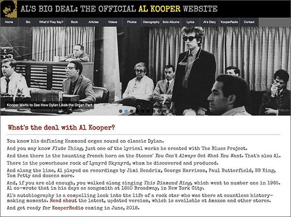
Al Kooper
I heard Al Kooper give a talk at MIT. I was captivated both by his stories and also by how humble he was about it all.
When I checked his website I found it had not been updated since 2007, 11 years ago. I contacted Al and we worked out a suitable arrangement and I started to rebuild his site from scratch.
The result includes a lot of fun stuff for fans of Al Kooper, Bob Dylan, The Blues Project, Blood, Sweat & Tears, SuperSession, Lynyrd Skynyrd, any rock music since 1960.
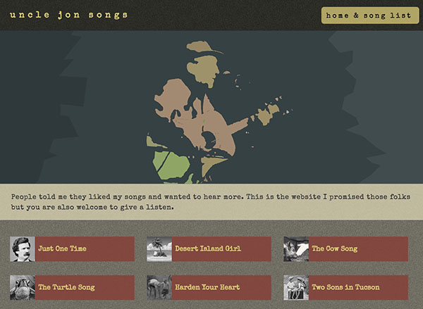
Uncle Jon's Songs
Here is a site for an old sixties folkie that can't set aside the idea of writing songs. You can listen to, and download, a series of his original songs.
Give it a listen. The guy's music is not half bad, but his website is terrific! The design goal was to create a distinct look that doesn't feel like any of the packaged solutions available.
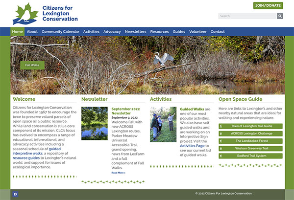
Citizens for Lexington Conservation
This citizens group is dedicated to preserving and enhancing the open spaces in Lexington, Massachusetts. The site was created in Wordpress using the Elementor layout system.
We used a set of Wufoo forms to connect to Mailchimp and to Stripe to collect annual dues and donations.
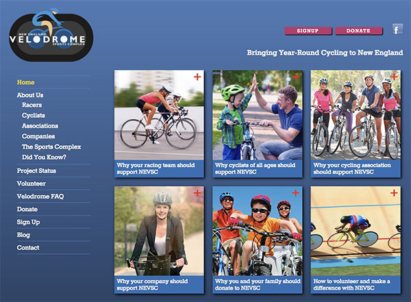
New England Velodrome
A dedicated group of cyclists has come together with the goal of creating a world-class year-round cycling center in New England. I worked with them to target their key audiences and place prominent targets for each group on the home page, each of which leads to further targeted content.
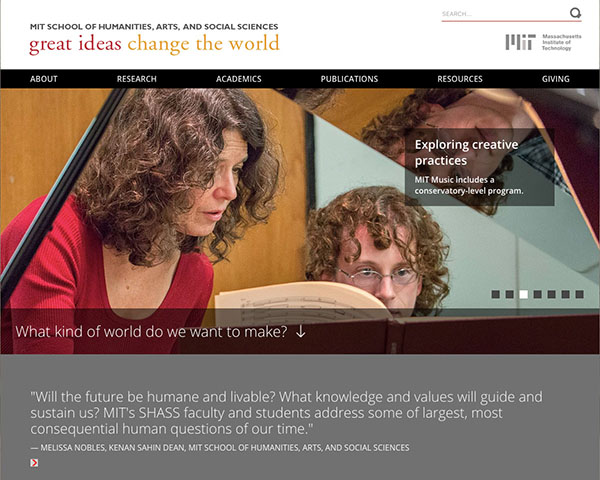
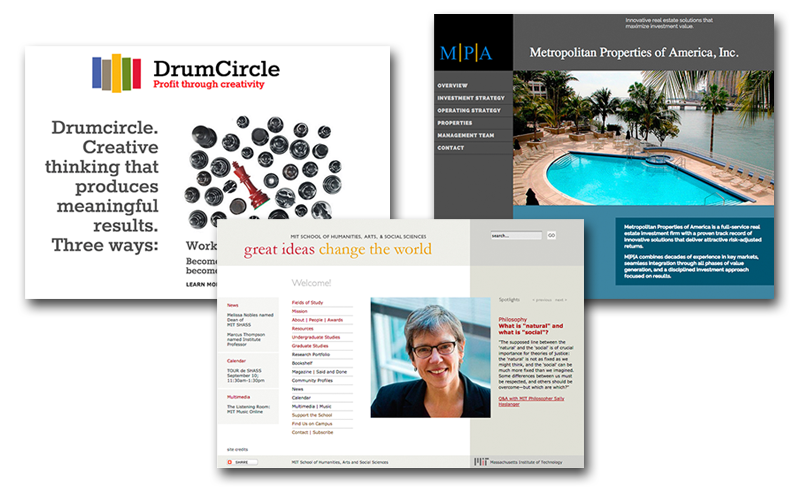
MIT School of Humanities, Arts & Social Sciences
Co-designed with Director of Communication Emily Hiestand, this site presents the surprising, large and diverse school at MIT, which gathers most of the non-science programs under one very large roof. Learn more about my work with MIT.
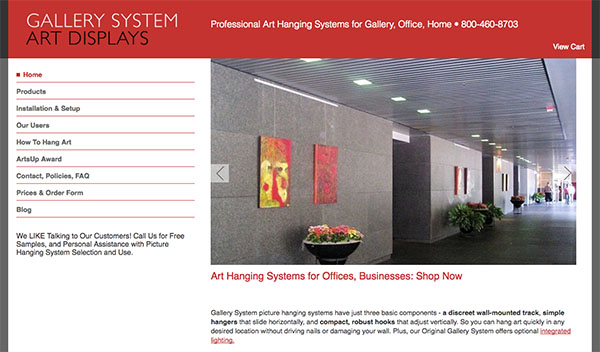
Gallery System
The Gallery System website is a full-featured online store, with a complex product structure: there are two main systems within the product family, some products work with one, some with both. We designed an easy-to-use web store which was then implemented in Drupal by our friends at Redfin Solutions.
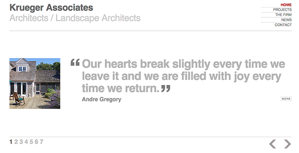
Krueger Associates Architects
A minimalist site for a Cape Cod architect with a devoted following. The homepage slideshow features quotes from clients including John Stossel and Andre Gregory.
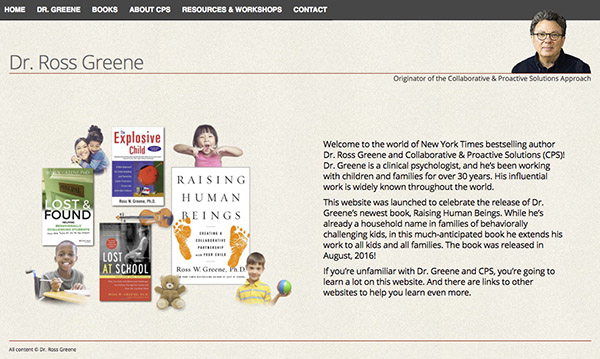
Dr. Ross Greene, Author
Dr. Greene has written a number of extremely influential books about raising "difficult" children. With his latest book "Raising Human Beings", he has extended his audience to all people and parents.
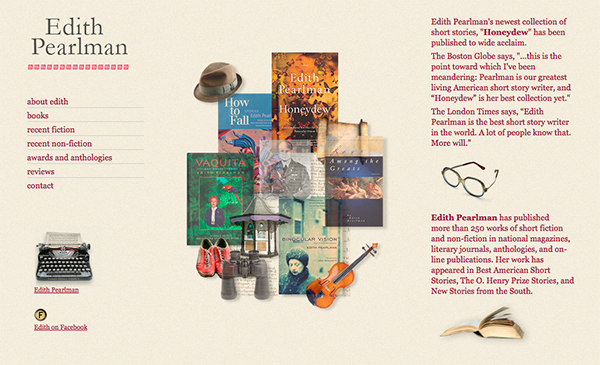
If the site reminds you of writer Edith Pearlman's site, shown lower on this page, that is because we modeled Dr. Greene's closely after Ms. Pearlman's very successful site.
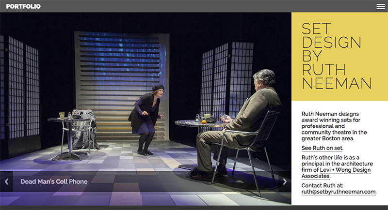
Set by Ruth Neeman
Ruth Neeman designs award-winning sets for professional and community theatre. This responsive site features all of her projects dating back to 1991. It uses a sortable table to allow site visitors to rearrange how the plays are listed.
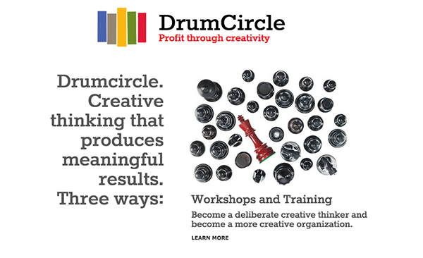
Drumcircle
A responsive site for a consulting firm that teaches people and organizations to "Become deliberate creative thinkers and become a more creative organization." We wanted a design that suggests the creativity that founder Anne Manning and her colleagues bring forth, but not a site so edgy and challenging that visitors would not know how to navigate.
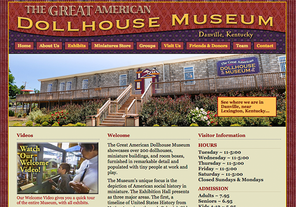
The Great American Dollhouse Museum
This is one of those remarkable, unforgettable local treasures that make smaller cities worth visiting. Located in Danville, Kentucky, this museum contains hundreds of dollhouses, all arranged in neighborhoods, populated with little people with fascinating stories. I also did the videos for this site, which you can see sprinkled through the pages. More about my work with the Museum.
Author Edith Pearlman
Award-winning author Edith Pearlman has not been as active lately due to health issues, but the website we created together is a strong model for how an author's site can work, with information on books, reviews, and awards.

